![]()
Today marks this website’s 15th year.
Last year, I had a layout throwback where I posted a bunch of old layouts that I made for this site since the begining. This year, I thought of showing the logos that I’ve used for this site throughout these 15 years.
Here goes!
![]()
This is the first logo I made when I was in college. I drew this myself way back when I had so much time to do this and that. I lost the original PSD file of this logo when my hard drive broke, so this is the only copy I have of this left.
For those of you who might want to know, the font I used for my name is an old blackletter font that I could not find anywhere on the Internet anymore. However, I found a very similar font to it called Black Rose Regular.
![]()
This second logo was made for me by my ex-team lead, Reynan Parico. He’s a really cool guy who has a wide range of artistic talents that you’d go green with envy, sometimes. He draws traditional and digital, does all sorts of designing for prints, web, 3D, painting, sculplting, etc. When he made this logo for me, he whipped it for like just 30 minutes or something. At that time, he was into annagram logos and such, so he thought he’d made me one too. Isn’t it cool? Someday, I will have this logo tattoed somewhere in my body. Haha!
The font I used for the second logo is called Lucida Sans Unicode. It’s one of the default fonts of Microsoft.
![]()
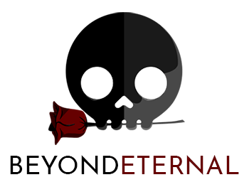
My latest logo is a skull biting a rose, as you can see above this blog’s header. It was made by my collegue, Mark Lozano, one day early this year. He drew this quicker than 30 minutes. I do not understand how they can draw that fast! Originally, this logo’s skull is white and is meant for a darker background. However, since my blog’s background is white (for audience’s readability), I changed the skull’s color to black.
The font I used for this logo is Josefin Sans. It’s a free Google font. I also plan to use this same font as this blog’s identitity font, moving forward.

And lastly, this is not a logo, but it’s still related to my blog’s identity so I’m including it here.
This chibi artwork was drawn by my friend Beannie, who’s a freelance artist. This chibi is my blog’s official mascot. She’s supposed to be me in chibi version (not that I don’t look chibi enough already). I do not look like her now, but around the time this chibi was drawn, I was pegging a short fluffy hair similar to the one in the chibi. My chibi version also has messy hair. Haha!
She so’s cute and I’m so happy with it, but I have not had the chance to use her yet! She comes in several poses and I plan on commissioning for several more poses and/or outfits later on.
6 Comments
I super love your current logo ❤️
Thanks achi! ❤️️
Siiiigh I miss blogging publicly SO badly, dude! Every time I stop by here I’m like… I really should just make a comeback, because your blog being around is just so inspiring for me.
I love your new logo, and your little chibi self!! Omg!!❤️❤️
Thank you Sammy! You’re the only one I kept going back to LJ for. XD
Wow, 15 years! I think I’ve had websites/blogged for about that long too, but not had the same site the whole time. That’s impressive 🙂
Your logos do look really good, the skull is super cute and I love the annagram one! It would probably make a great tattoo. 😊
I have a lot of friends who have been blogging for that long and kept switching blog names, too. I have revamped this site a lot throughout the years and was just lazy to think of a new name so I kept this old one since then. Haha